
What are the Buckaroo Banzai production illustrations?
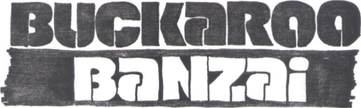
Buckaroo Banzai Production Illustrations
by Dan Berger
(This article originally appeared as part of In Medias Res: The Buckaroo Banzai Production Binders By Sean Murphy, Dan Berger, DeWayne Todd, and Steve Mattsson in the August 2019 issue of the World Watch One newsletter.)
As discussed in the introductory article, over half of the goodies found among the three binders comprising the Buckaroo Banzai production documents are visual images, either in the form of storyboards (discussed in the next article) or production illustrations. This comes as no surprise. Film is a visual medium, and W.D. Richter had a very clear game plan in place to achieve the look he was after.
In a June 12, 2019 email, Richter said, “Mike Riva [production designer] and Jordan Cronenweth [cinematographer] were to be the production’s heart and soul. Jordan’s inspiration (and his lighting package) never left us, and Mike truly created so much of the movie that I feel he, Mac [screenwriter Earl Mac Rauch], and Richard Marks (our editor) “made” the movie as much as I did.” As production designer, Riva was responsible for the overall visual look of the picture, while Croneneweth’s responsibilities as cinematographer encompassed the technical and artistic decisions behind lighting the various scenes and capturing them on film, as well as managing the crews responsible for these tasks. Sadly, shortly after filming began, David Begleman fired Jordan Cronenweth from the production. Thus Cronenweth’s inspiration remained imprinted on the film even after “leaving” the production.
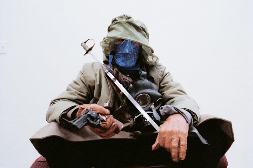
He's got the look: According to W.D.
Richter, Michael Riva was the first person put on payroll for Buckaroo
Banzai.
In this rare photo taken by Richter, Riva explores possible Lectroid wardrobe looks by improvising a “found objects” approach to the Lectroid aesthetic.
In this rare photo taken by Richter, Riva explores possible Lectroid wardrobe looks by improvising a “found objects” approach to the Lectroid aesthetic.
Cronenweth’s name immediately caught my attention due to his work as director of photography on Blade Runner. He was instrumental in helping to achieve the unique look of that film through his remarkable lighting set-ups, and I couldn’t help but ask if that film had caught Richter’s eye in the lead-up to Buckaroo Banzai. Richter responded, “I definitely wanted to bring the Blade Runner visual richness to the film because I wanted it to look haunting but sound like Dr. Strangelove. Mac’s script triggered that approach for me.”
Cronenweth wasn’t the only Blade Runner alum working to deliver Buckaroo’s visual punch. Three people are listed as Production Illustrators in the credits for Buckaroo: Tom Southwell, Tom Cranham, and Sherman Labby. Of those three, both Southwell and Labby were production illustrators on Blade Runner as well.
As fate would have it, the production illustrations in Binder#3 all appear to be the work of Tom Southwell. Southwell signed or stamped the vast majority of his contributions in the binder, making it easily identifiable as his work. That left a few unmarked pages of unknown provenance floating in the binder. I asked Richter for clarification on this point. “Our budget was so limited that no illustrator was on full time,” said Richter. “I think when one of them had finished a bunch of pressing work and left and was unavailable when we needed more, we brought on the best we could find at that time.” Sadly, this information was not much help in narrowing down the specific work of each illustrator.
Given that the bulk of the production illustrations in Binder #3 are signed by Tom Southwell, this section will focus on him and his work as seen in the Buckaroo Banzai Production Binders.
Some of this work has already appeared in the pages of World Watch One. Several versions of the Yoyodyne logo appear in the April 1986 issue, as do a sketch of the Blue Blaze Irregular logo on the cover of the August 1985 issue and again in November 1986. A stylized 1950s Jet Car image also appears in the November 1986 issue, while the “Can Hanoi Shan Kill Buckaroo?” comic book cover sketch crops up in the Fall 2004 issue.
For the purposes of this article, we have done some editing to the images as they originally appear in the binders to make more efficient use of page space for layout purposes. None of the actual logos and sketches have been altered, but their placement on the page and the placement of notes written on the original images may have been shifted from their original appearance.
According to the Internet Movie Database, Tom Southwell’s first illustrator credit in film appears in 1979’s The Muppet Movie. His credits as a production illustrator previous to Buckaroo include Nice Dreams, Heart like a Wheel, Stroker Ace, and uncredited work on the TV miniseries V. His best remembered work from this period is probably from Blade Runner, where he was responsible for concept illustrations ranging between Spinner logos and key cards to neon sign designs and magazine covers, and even a makeover of Syd Mead’s original design for the vidPhon case.
Southwell’s work on Buckaroo Banzai was similarly varied. It is difficult to ascertain what percentage of his work on the film is represented in the production binders, but it is clear that his talents were put to a wide variety of uses. In total, the binder contains 82 pages of logo designs and lettering experiments in various degrees of development
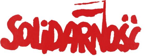
Of particular interest are several annotations sprinkled among the sketches. These appear to be a mixture of Southwell’s notes to himself—likely gathered from a combination of production meetings and his own brainstorming, and what appears to be director’s notes made by Richter. The notes are sometimes a little cryptic. Their primary function was to provide the broad strokes of how to approach a specific design rather than a detailed roadmap. The following is an example pertaining to the development of a specific style of lettering for Buckaroo’s logo: “Buckaroo Banzai: Solidarity. Dripping paint. No Western. No Japanese style lettering.” Southwell then appears to quote a guiding principal for the design voiced by Richter, ‘The words themselves say those things.’ –R.R.”
These initial notes are followed by what appear to be an initial stab at hashing out ideas surrounding the principals provided:
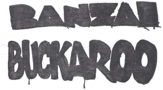
This is followed with a note by Southwell reminding himself to ask Richter: “Is this the logo B.B. would use himself?” He then lays out exactly how Buckaroo might use the logo, “On the side of the bus? Comic book? B.B.’s personal mark? Movie title?” There is a line below that followed by further notes for style ideas regarding fonts, “Try bold W.W. II German letters. Gerald Scharff style lettering.”
Southwell’s note about World War II era German lettering is confusing. A separate page includes two graphic design images in German, presumably to provide reference for the lettering in question, but they appear in conjunction with development of an unused Lectroid banner rather than a Buckaroo logo.
The “Gerald Scharff” reference is also puzzling at first: a Google search of that name failed to reveal anything easily connected to lettering styles of any kind. It is probable that Southwell was referring to Gerald Scarfe, the English illustrator responsible for Pink Floyd’s album art on The Wall (1979) and the animation sequences in the 1982 film of the same name.
This tracks well with Southwell’s “Solidarity” note. Here he is most likely referring to Jerzy Janiszewski logo design created in August 1980 for the Polish Free Trade Unions that defied Soviet law during the Soviet Union’s occupation of Poland. The logo became a national symbol of freedom and democracy, themes that might resonate with a hero like Buckaroo. It is also done in a loose style similar to Scarfe’s lettering on The Wall:
Taking inspiration from both Scarfe’s and Janiszewski’s designs, Southwell worked up a series of variations on the same look:
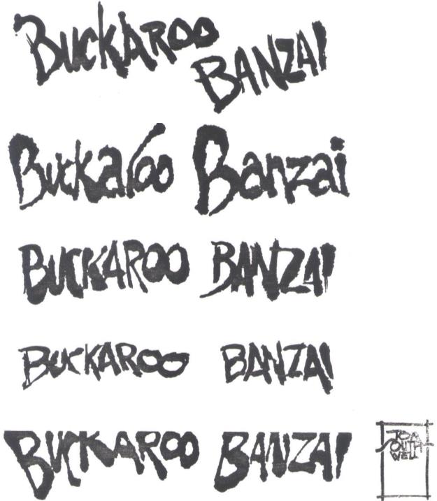
Sadly, none of the designs from this line of development managed to make their way into the final film. One of the variants nearly made it by way of the alternate comic book cover seen on page 54 in this issue.
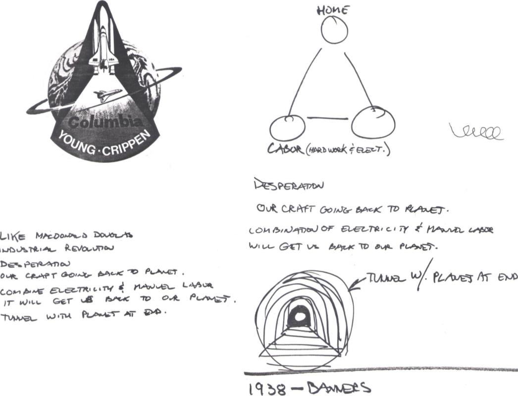
Another rich deposit of annotations appears with the initial design ideas for the Yoyodyne Propulsion Systems logo. The first notes we find are attached to a space shuttle mission patch provided as visual reference. The notes read, “Like McDonald Douglas. Industrial revolution. Desperation. Our craft going back to planet. Combine electricity & manual labor. It will get us back to our planet. Tunnel with planet at end.”
Yoyodyne from soup to nuts: The
Buckaroo Banzai Production Binders yielded an illuminating
overview of the Yoyodyne Propulsion Systems logo from
brainstorming (Above) to working through a 1950s version of the
logo (Below, Top to Bottom).
It is clear that “desperation” was a difficult abstraction to weave into the design, represented perhaps by the Earth caught in the same vice-like grip the Lectroids’ feel in exile on a goddamn planet of monkey boys.
It is clear that “desperation” was a difficult abstraction to weave into the design, represented perhaps by the Earth caught in the same vice-like grip the Lectroids’ feel in exile on a goddamn planet of monkey boys.
This first stab at riffing off a combination of Lectroid characteristics (electricity, industry), motivations and actions (desperation, manual labor, going home, etc.), and ways to visualize those attributes (visual reference, “tunnel with planet at end”) is accompanied by a second page that frames some of these features visually. A note accompanies the sketches, reaffirming the concepts, “Desperation. Our craft going back to planet. Combination of electricity & manual labor will get us back to our planet.” There is also a brief note that reads, “1938—Banners,” at the bottom of the page.
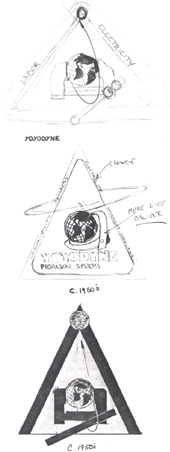
Only one sketch of a Lectroid banner appears in the production documents. By contrast Southwell’s work on the the Yoyodyne logo was long and involved. The logo went through an evolution of sorts, beginning with how it might have first appeared with the rise of the company in the 1950s. This version of the logo in particular appears to be the sandbox in which Southwell experimented with visualizing the attributes spelled out in his initial notes. Three different versions of the logo from this era appear among his production illustration sketches in various degrees of development and polish. The final design in the sequence introduced many of the elements that appear in the logo as seen in the film, but the incorporation of “Yoyodyne Propulsion Systems” within the design remained unresolved.
Southwell abandoned the triangular configuration to focus on refining the caliper motif and Yoyodyne lettering in his 1960s and 1970s versions of the logo. It is interesting to note that the shape of the stylized missile or rocket launching from Earth in the design
also changes from design to design, while the earth itself appears as a globe from the 1950s through the 1970s designs.
The 1980s logo resolves all of these experiments into the design seen in the movie. The triangular design of the 1950s is back, now merged with a slightly simplified version of the caliper design from the 60s and 70s versions. The globe motif has been replaced with a plain circle, which could just as easily serve as a representation of either Earth or Planet 10. The logo that appears here is one step removed from its final draft, as notes from Richter indicate that the design should be flopped along the horizontal axis and the “Yoyodyne Propulsion Systems” text enlarged.
Another logo with a notable evolution is the Blue Blaze Irregular patch seen on Scooter Lindley’s hat in the film. From all appearances given the documents available, the Blue Blaze logo was more or less born full grown from the head of Southwell and approved by Richter on May 9, 1983. A series of four tiny doodles playing with alternate takes on the design appear on the same page, but it is unclear if they were predecessors of the design or variants sketched out for further exploration.
What is clear is that, by May 18, Southwell developed two slight variations on the same design for what a note describes as a “Hand wrought bronze or iron [logo] for a gambling house or branding iron.” One of the designs shows two Bs in a circle facing away from one another. A second shows two Bs in a circle facing inwards towards one another. Eventually, the variant with the two Bs facing outwards from one another was adopted as the design for the kaleidoscopic display of the film’s opening title sequence just before the opening crawl describing Buckaroo’s convoluted upbringing and imminent assault on the dimension barrier.
On May 23, Southwell was back at playing with the “branding iron” variation of the logo again, this time with the inward and outward facing Bs in a square rather than a circle. This design is reminiscent of seals often found on Japanese wood block prints, but it is unclear what function they were designed to serve in the film. This may be an indicator of why the designs were absent in the movie: they were simply an experiment that never found a use on screen. Such casualties of the design process are not unusual, but it is a shame that such an attractive logo went fallow.
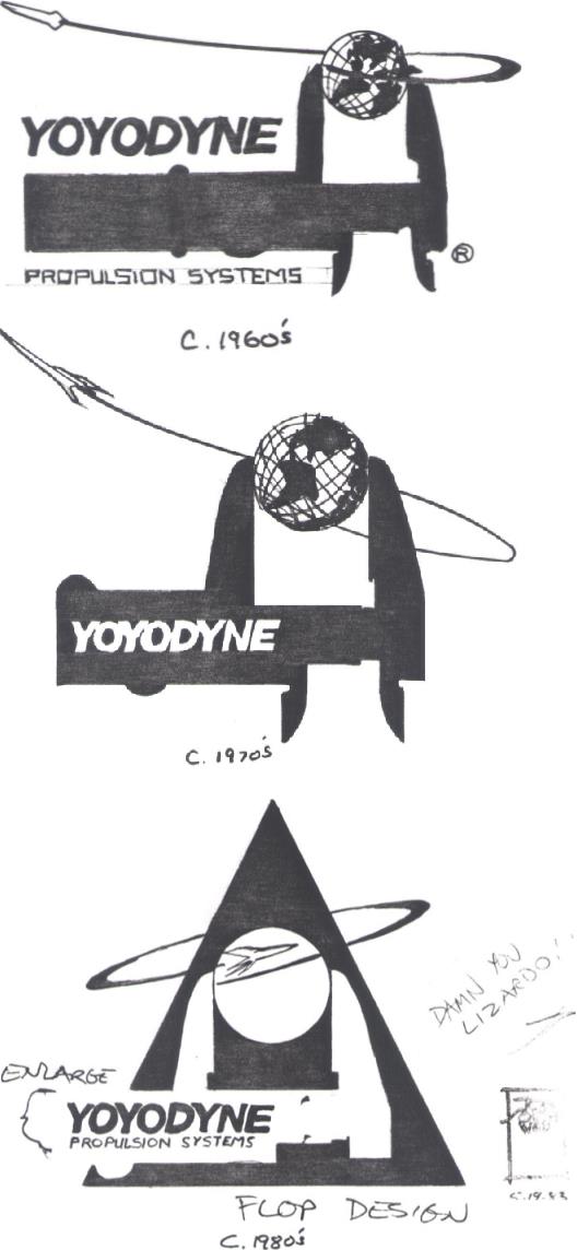
Above: Tom Southwell takes the
Yoyodyne Propulsion Systems logo through its paces in designs
from the 1960s (Top), 1970s (Middle) and 1980s (Bottom).
A note from W.D. Richter saying “Damn you Lizardo!” can be seen scribbled to the right of the 1980s version of the logo.
Clearly the sense of fun actors and crew often associate with the making of Buckaroo Banzai started from the top with Richter.
A note from W.D. Richter saying “Damn you Lizardo!” can be seen scribbled to the right of the 1980s version of the logo.
Clearly the sense of fun actors and crew often associate with the making of Buckaroo Banzai started from the top with Richter.
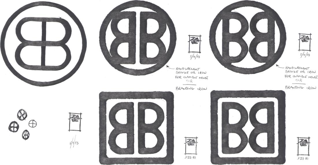
Above: Of note amongst the Blue Blaze Irregular and “branding iron” logo designs is the inclusion of dates and Southwell’s trademark stamp. Less certain is what the dates represent.
Many of the illustrations found in the binder are stamped but not dated, while some of the stamped work appears to be dated in a different hand than others.
Typically, illustrations are stamped and dated to represent a locked design or director approval for use in a film.
The presence of a second set of handwritten dates may indicate images dated by Southwell for his own reference.
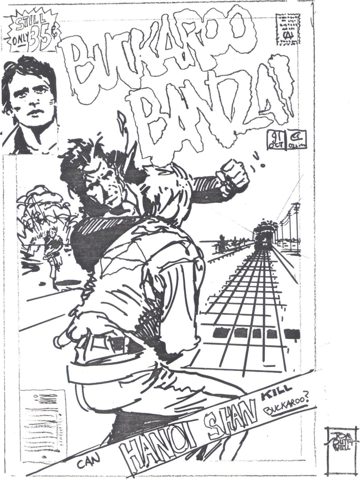
Can Hanoi Shan Kill Buckaroo? This alternate take on a Buckaroo Banzai comic book cover by Tom Southwell was one of several concept illustrations left unused from the pre-production process.
The day after Southwell’s “Branding Iron” logo was approved, the beginnings of the Team Banzai Jet Car logo emerged on May 19, 1983. Two versions—a rectangular logo showing the 1980’s Jet Car in profile complete with flames surging behind it, and the more familiar circular design with the Jet Car and flames seen from above—appear in the binder. Richter wrote the word “Patch?” as a question next to the circular design, indicating perhaps that the design was created first as a part of a general program of brainstorming and later identified as a candidate for the Team Banzai Jet Car patches seen in the film.
Richter requested that the 1950’s Jet Car replace its 1980’s counterpart and Southwell was off to the races. A second note by Richter muses if the rectangular logo should appear on the side of a van. Instead, the logo was developed to appear on the side of a semi-trailer. A second semi-trailer bears the circular logo shown below, but it is unclear what vintage of Jet Car appears on it. The semi-trailers appear briefly in a “blink and you’ll miss it” moment deep in the background during the opening credits to the film as Team Banzai prepares the Jet Car for its trip past the sound barrier and through the mountain.
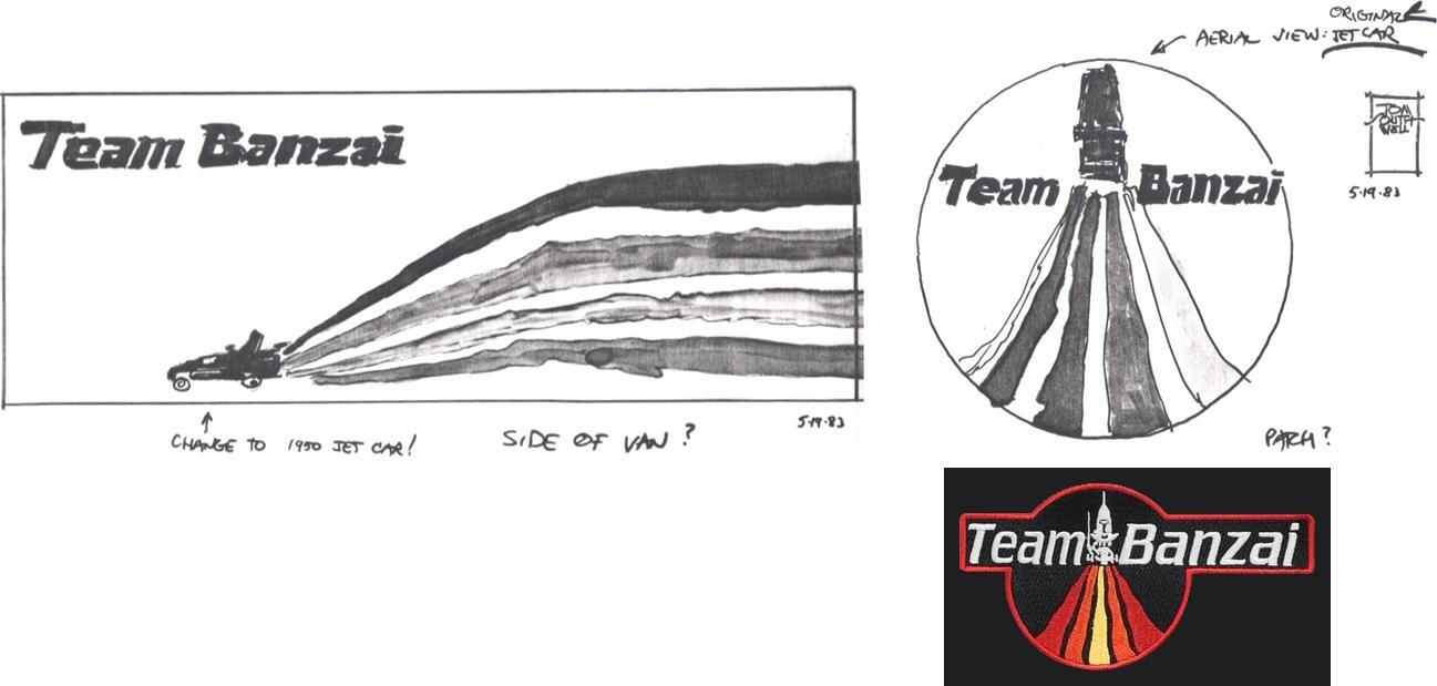
The Team Banzai Jet Car logo appears as both a side view (Top Left) and an aerial view (Top Right) of the jet car in these two designs both dated May 19, 1983.
The circular aerial version does not receive further treatment within the pages of the production binder, but an updated design featuring the 1950’s Jet Car
and an alternative incorporation of the “Team Banzai” text (Right) appears to be a lineal descendant of this early concept work.
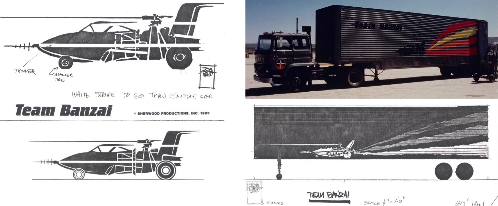
Meanwhile, the rectangular design and the
1950’s Jet Car image incorporated within it saw a great deal of
further exploration within the production binder, taking up no
fewer
than twelve pages—or approximately 1/8th of the entire binder.The annotated initial sketch of the 1950’s Jet Car (Top Left) and the finished version (Bottom Left)
used for the semi-trailer logo (Top Right), also seen in a May 23, 1983 sketch drawn to a scale of ¼ inch = 1 foot (Bottom Right). Photo courtesy of the Todd Archives.
The majority of the production illustrations fall along similar lines. Of the eighty-two documents in the binder, twelve are devoted to the Team Banzai logo, thirteen to the Yoyodyne Propulsion Systems logo, twenty seven map out a broad range of lettering and font experiments, and six work their way through the Blue Blaze Irregular logo design. The balance of the pages is an eclectic mishmash of obsolete logos, Jet Car illustrations, even an alternate comic book cover for the “latest issue” of Buckaroo Banzai that appeared in the film.
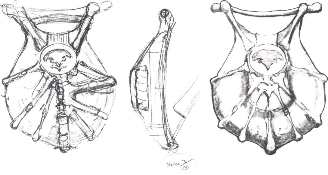
Mixed in with these more representative offerings are several other illustrations of note. Two pages are devoted to what appears to be a piece of Lectroid technology, inspired perhaps by the shape of a horseshoe crab shell. No annotations accompany the images, so it is difficult to tell for certain exactly what the sketches are supposed to represent. Given the almost breastplate-like shape of the object, it is possible that the sketches are for an early version of the breather vests that allow Buckaroo and the Hong Kong Cavaliers to see past the Lectroid disguises to reveal their true forms. The only other clue is that the sketch is at 3/16 scale. The rest is left to conjecture.
Arcana and addenda: While the majority of the production illustrations within the production binders fall into easily determined categories, (logos, font selections, visual reference, etc.), this sequence of images (Above) proved elusive.
They appear to be objects of Lectroid technology, but no notes were found to explain them. More easily identified and better marked are two sketches drawn by W.D. Richter (Below) as reference for further development during pre-production.
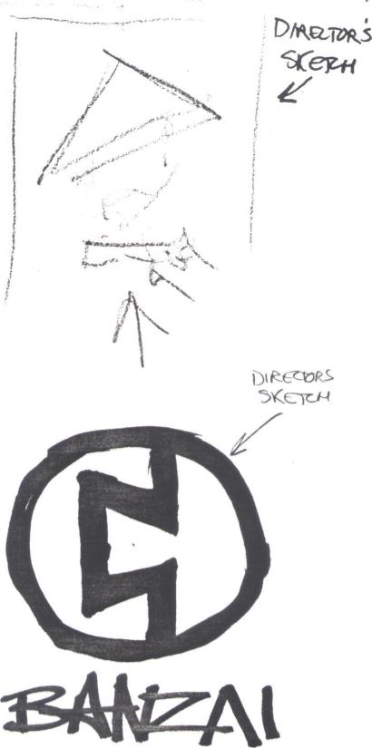
In addition to Richter’s annotations throughout, two of the director’s own sketches appear in the binder as well. One is an extremely rough sketch of Hanoi Xan that appears in conjunction with the sketches and notes for the alternate comic book cover. The same page contains a rough sketch of Xan by Southwell in which the World Crime League boss menaces an unseen adversary with a hand gun. If you cross your eyes and hold the sketch a couple of feet away from your face, it is possible to imagine that Southwell’s Xan sketch was based on notes that artist Michael Wm. Kaluta later developed into the comic book cover prop seen in the film (and discussed in our March 2019 issue). Richter also sketched a Banzai logo that appears in the binder. Southwell refined this design as part of his production illustrations duties, but the concept appears to be one of several “roads not taken” among the logos.
There are several absences among the production illustrations, most notably the Banzai Institute seal, the red and white 88 logo, and the triangular BB logo seen most prominently on the grill of the World Watch One bus. Without access to a more comprehensive catalogue of production illustrations and people familiar with exactly which production artists worked on what during pre-production, much is left to speculation. Tom Southwell was unavailable for an interview.
What is clear is that there was much more in store for the illustration team than logos and fonts. Envisioning the “look” of a film is only one of several fronts tackled by the production illustrators, as we will see in our next article about storyboards.
What are the Buckaroo Banzai Production Binders?
- What are the Buckaroo Banzai production illustrations? (You
Are Here)
- What is the Buckaroo Banzai
production script comparison?
- What are the Buckaroo Banzai
production storyboards?
- What is the Essential Buckaroo in the Buckaroo Banzai production binders?
This page was last updated on May 10th, 2020.
Maintained by Sean Murphy [figment@figmentfly.com]